The default WordPress «Archive» block becomes very long and narrow, when months accumulate. Here is an easy way to make it more compact.
The problem
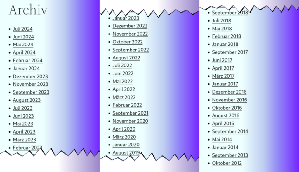
One of my blogs looked like that after a few years of action (wrapped for better visualization; in the original, it is one huge vertical strip):

The goal
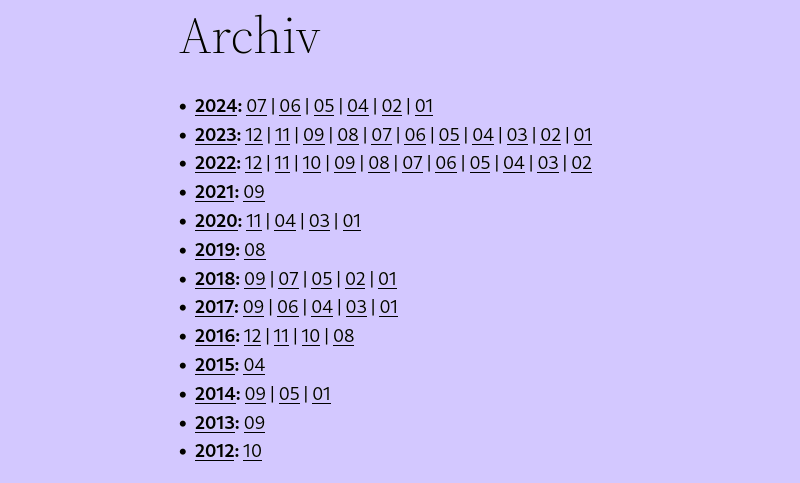
It would be much nicer if it looked like in the heading:
- One line per year
- Within each line, the sequence of the months (only those with active posts)
Much nicer, isn’t it?


The code
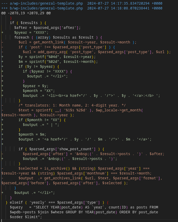
Here are the code changes in wp-includes/general-template.php (red lines, preceded with a minus, are the lines that I deleted; green with plusses, are the ones I added):

If you store this in your /usr/www/wordpress (or wherever you have WordPress installed), then applying the patch on a (Linux, Unix) system is simple:
patch -p1 < general-template-compact-archive.patchThat’s all! patch is an amazing tool, it will look for where this change fits and if there is a fit, it will modify the file accordingly, saving the original with a .orig extension. (If patch thinks aplying the changes is unsafe or something else seems wrong, it will prompt you instead of making anything dangerous.)
Yes, it does require patching one of the default WordPress files. So you need to repeat it after every WordPress (core) upgrade. I wrote that code over four years ago, and all that has happened, is that the code block was moved further down in the file.
So it the loop itself never to be updated during many years. So I think it is safe to assume that this will not constantly break differently in the near future. And even if the code changes: All that happens, is the patch will not be applied, and the boring old archive list will continue to be visible.
Enjoy your new compact Archive!


